Insight Design News & Blog
Logo Design Wichita, KS – Tanya's Soup Kitchen
http://www.youtube.com/watch?v=73wiBugaNX0
The Tanya's Soup Kitchen logo design is the image of Tanya Tandoc and a bowl of soup in the same image. The Tanya's Soup Kitchen logo design is a visual metaphor to show Tanya is the equal of a true artist. Tanya puts herself into her creations, her art, her soup.
In the logo design Tanya's face is the bowl, her mouth is the spoon, her eyes are splashes/droplets and her hair is the steam. All the graphic design shapes and lines of this logo where drawn and redrawn, then scanned into digital form and re-drawn digitally. All the graphic design edges and curves were smoothed and softened to invite the viewer and remind the consumer of how beautifully delicious Tanya's soups really are.
Tanya and the Tanya's Soup Kitchen logo design and graphic design brand identity have become interchangeable, recognized as one-in-the-same. Her website design and Facebook persona allows Tanya to share her unique attitudes with her many fans and friends. All the graphic design in Tanya's brand identity reflects and has become the symbol for Tanya's amazing personality. Tanya has become more than a proprietor of a sheik restaurant, she has become a food goddess and a beacon for sub-culture lifestyles and attitudes. The early lines anticipating a bowl of Tanya's amazing soup often extend from one side of the restaurant to the other and even out of the door. Tanya has become famous in the Wichita area and well know in the highest perches of the food industry.
This brand identity video includes; logo design, website design, environmental and print.
oin the attitude at
http://www.facebook.com/tanyassoupkitchen
http://www.facebook.com/tanya.tandoc
http://tanyassoupkitchen.com/
Tanya's Soup Kitchen is located at: 1725 East Douglas Avenue Wichita, KS 67211
Tracy Holdeman is founder and creative director of Insight Design Communications, executive creative director of WhisperNewYork. His logo design, brand identity, website design and graphic design work has been recognized with over 100 national and international awards.
Insight Design Communications has been honneres with over 100 international awards for logo design, graphic design and brand identity design.
You can see more of Tracy Holdeman's graphic design work at Logo Design Wichita
Logo Design for Squeezer's Palace
Squeezer's Palace logo design is a re-creation of a 70's ice cream store. We developed typography for the logo based on historical 70's fonts. We hand illustrated the logo letterforms to match the essence of the original hand drawn logo. Redesigning the letterforms also allowed us to make the logo more compact and therefore more legible as store signage.
Wordmark or signature mark logo design
Not all logo designs are made with images, some are made with texts and images while others are simply text. A logo design that is only text is called a typography logo, logotype, word mark or signature mark. The type can be very straight forward or illustrated to communicate a specific feeling or attitude. A typographic logo can use a common font purchased from a font house, a modified font, a hand drawn graphic design font or a computer illustrated font. We rarely use a purchased font for a logotype because anyone can purchase the same font and use it. On the other hand, a specially created font will be unique in the marketplace and be better protected by copyright laws.
Client: Squeezer's Palace logo design
Industry: Restaurant logo design
Style: Typographic logo design
Location: Wichita logo design
Blend & Grind logo design
Blend & Grind is a smoothie, coffee, and juice bar located in the downtown area of Raleigh, NC. The store front is located in a high end "shopping center" with an upscale industrial feel (wood and metal). Blend & Grind appeals to the young modern customers that go to the local colleges as well as the older wealthier customers that live in the area. This logo is a circle divided into four parts: steam from coffee, juice squirting and two gears one represents a coffee cup and the other an orange. The leaf on top helps visualize the idea of an orange and signals a healthy choice to consumers. Logo Design Raleigh, NC. By Tracy Holdeman
Logo design by Insight Design Communications
New Logo Design and New Website Design
http://youtu.be/RzUHAUFU3Fc
JunkPro is a professional junk removal business that we completely re-branded from new logo to new website design. The website design allows JunkPro to change and update easily with a content management system (CMS). Our client even can adjust his complex online consumer scheduling from his phone. We also designed and built the JunkPro website with search engine optimization (SEO) for excellent Google rankings. 1-800-JunkPro.com ranks number one on Google keyword search " junk removal wichita" and number one on Google local listings keyword search " junk removal wichita". The website design is quick to navigate, easy to understand and engages the consumer immediately with key information and a simple call to action. So now that our client is number one on Google the website design also moves customers to act.
We can't thank our client enough for all of his effort and assistance in developing this website.
Logo Design Wichita, the website of Tracy Holdeman and his team. For websites exceptionally branded, geared for search engine optimization (SEO) success and beautifully designed websites call or e-mail us. We specialize in website design, graphic design and logo design. Website Design Wichita.
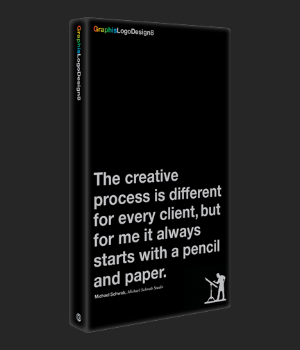
Insight Wins four International Logo Design Awards to be featured in Graphis Logo Design 8
Insight Design Communications wins an four international logo design awards to be featured in Graphis Logo Design 8. Insight Design Communications is in select company, only a handful of agencies, design firms of brand development companies won for gold awards. Tracy Holdeman, Executive Creative Director of Insight Design Communications, has now had 20 of his logo designs featured in Graphis Logo Design.
This latest installment of the Graphis Logo series features the finest selection of original logos, corporate logos, symbols and trademarks from around the world ranging in style from the simple and direct to the elaborately illustrated. In this edition, we are also including an interview with Starbucks’ foremost creative executives about the recent redesign of their brand logo, a Q&A with Michael Schwab on his creative process, and a memorial tribute to the late Doyald Young along with a collection of some of his greatest graphic logo designs. In addition, all logos presented in this comprehensive collection are cross-referenced and indexed for easy access, making this publication an invaluable resource for graphic design firms, clients, professionals and students alike.
River of Life Worship Center
Pentecostal Church
Logo Design Haysville, Kansas
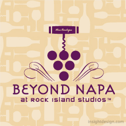
Beyond Napa
Retail Store Selling Wine and Wine Accessories
Logo design Wichita graphic design
Lost Art Development Co.
Discovers and develops artist art and ideas to retail products
Logo design Wichita graphic design
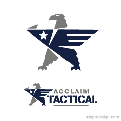
Acclaim Tactical
Acclaim Tactical is a retail store selling guns, gear and clothing to the law enforcement, military, fire and security community.
Insight Design Communications is one of the most recognized brand and logo design firms in the United States working from our Wichita, Kansas location with clients from across the country including places like Kansas City, Dallas Texas, Oklahoma City, Wichita KS and more.


